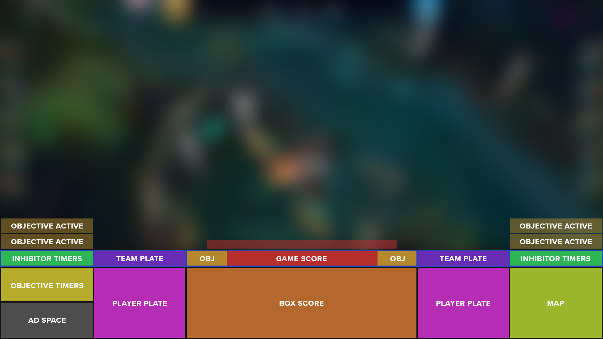
UI/UX and Broadcast Graphics Design
LoLeSports HUD
The League of Legends eSports League has gone through numerous distinct broadcast styles, each with the common goal of providing the audience with an enjoyable experience. That experience is fulfilled by providing information that’s quick and easy to find and comprehend, visually engaging to bring the viewer closer to the game, and an experience that is second to none.
The goal with this project is to find a way to take a step forward and innovate the scoreboard HUD by improving readability and making the content more digestible for newer fans and players.
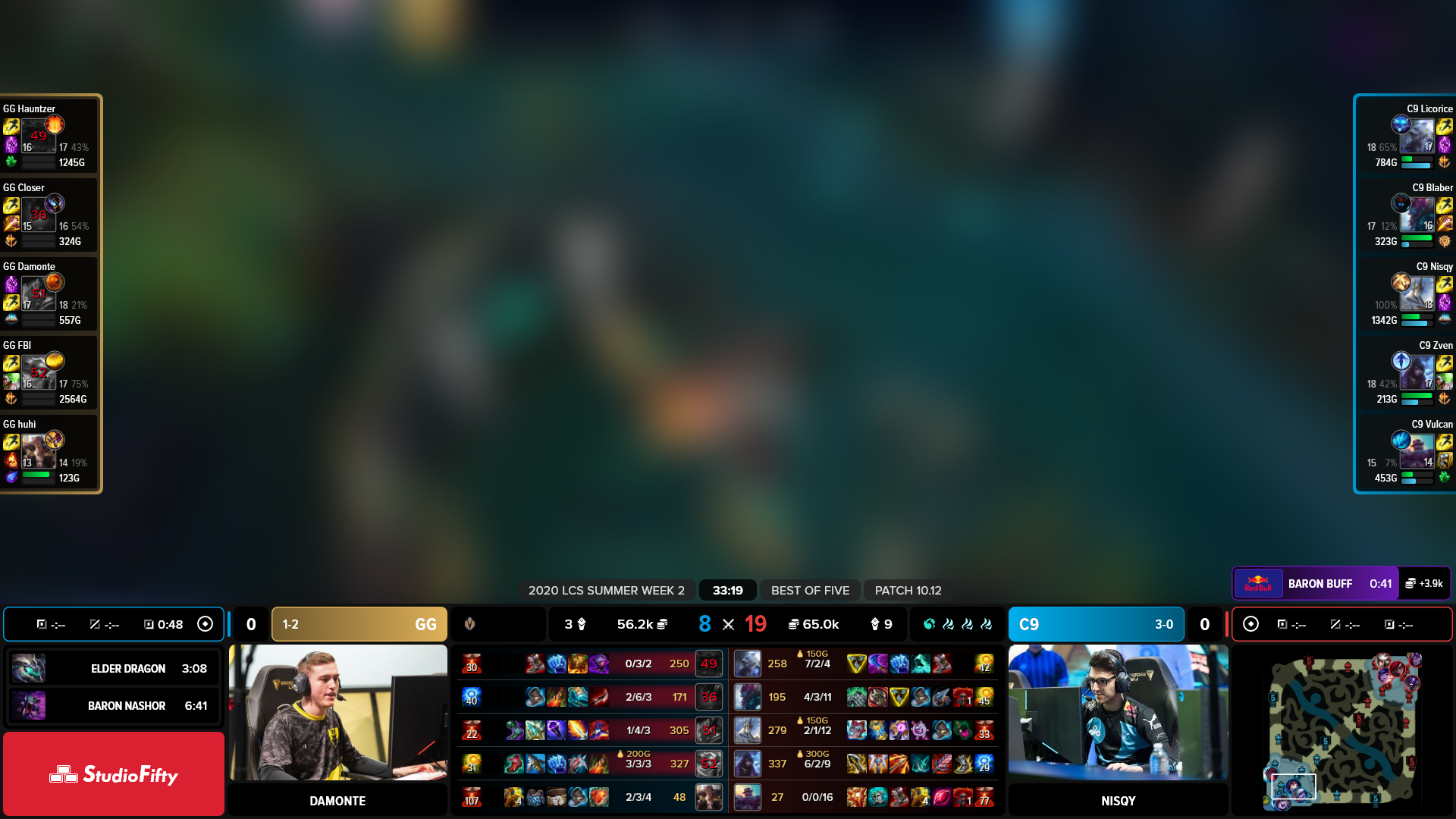
Project Goals
Readability
Establish a more clear/dynamic hierarchy
Format
Decrease overall overlay footprint
Reduce number of 'detached' HUDs
Accessibility
Tell the story of the game in a way that new viewers can easily learn and understand
Over 3.4 Million Viewers
The HUD for the most viewed independent League of Legends tournament of all time*
While many of these various scoreboards successfully communicate large amounts of information for the complex game and implement clean and attractive displays, many find the total real estate of the HUD along with the scattered sections of info takes away from their viewing experience and makes the sport visually off-putting for more unfamiliar viewers. Additionally, the abundance of information and lack of clear hierarchy add to creating an overwhelming experience for those less experienced.
CH-01
Researching
Researching
2015
2018
2020
2021
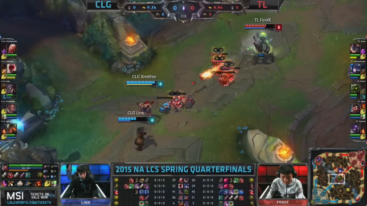
Early Stages
In the early days of League of Legends esports, the scoreboard and HUD information executed the then current style of the game perfectly. It was also small and not distracting from the gameplay.
Refinement and Modernization
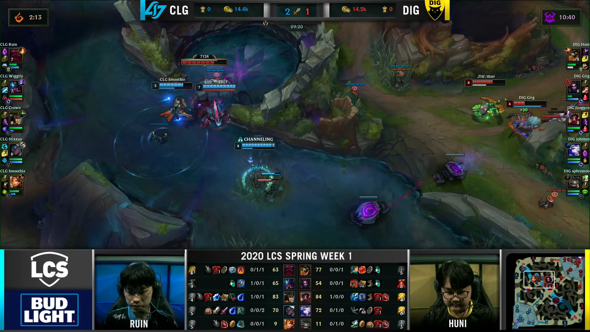
As technology improved and the graphics/style found a more refined and modern feel, the esports scoreboard followed suit.

Expansion and Growth
As the sport expanded, sponsorships and team recognition became more important. This period of time was viewed as one of the rough spots by fans, as the league experienced growing pains and changed its identity.
Style Improvement
The Korean LOLesports league took advantage of new game technology to create a brand new style unique to their leagues branding and create a layer of separation between the casual and the competitive sides of the game.
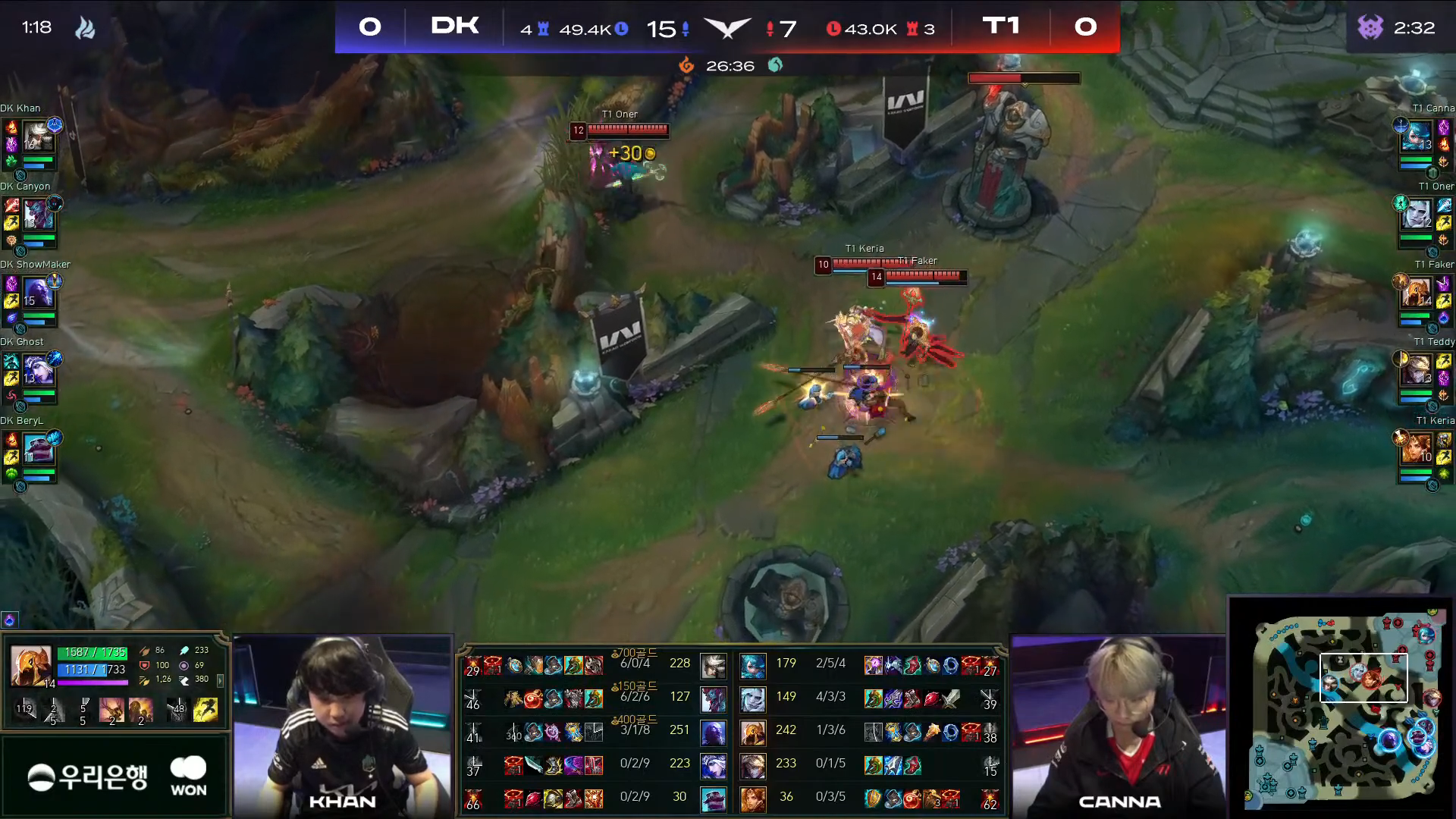
Taking inspiration from more common and traditional American sports and their television broadcast packages, I experimented with different ways to reduce the overall footprint of the HUD. Throughout this phase I continued to question how I could achieve this without sacrificing important information or visibility from long distances (considering fans watching from the cheap seats in arena sized venues) and how I can help newer viewers learn more about the game.
CH-02
Sketching
1
2
3
4
5
6
7
8
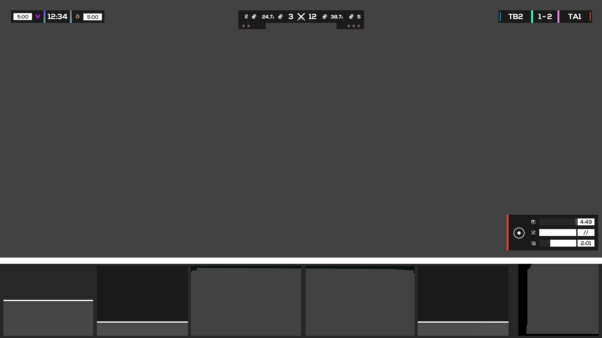
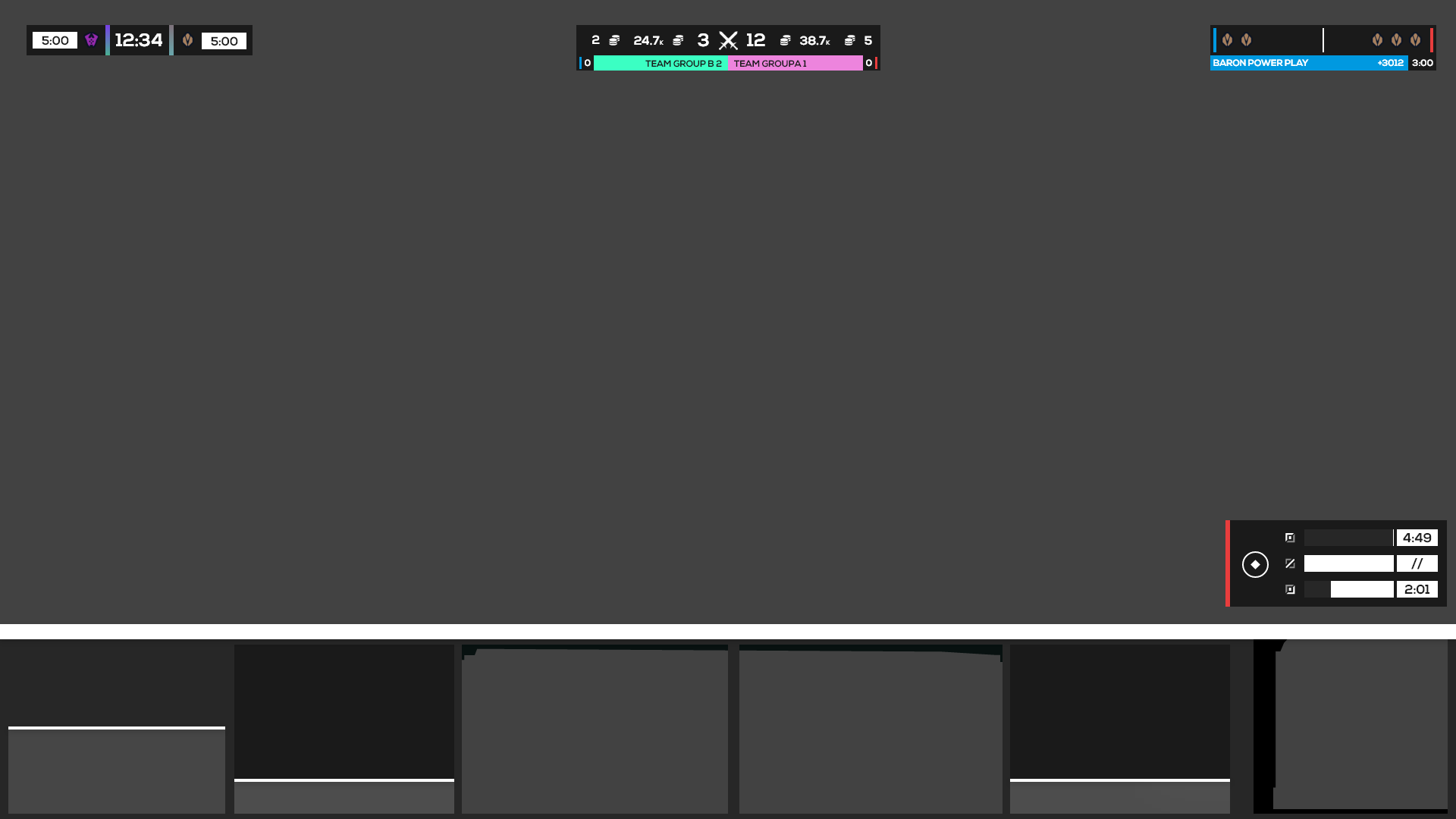
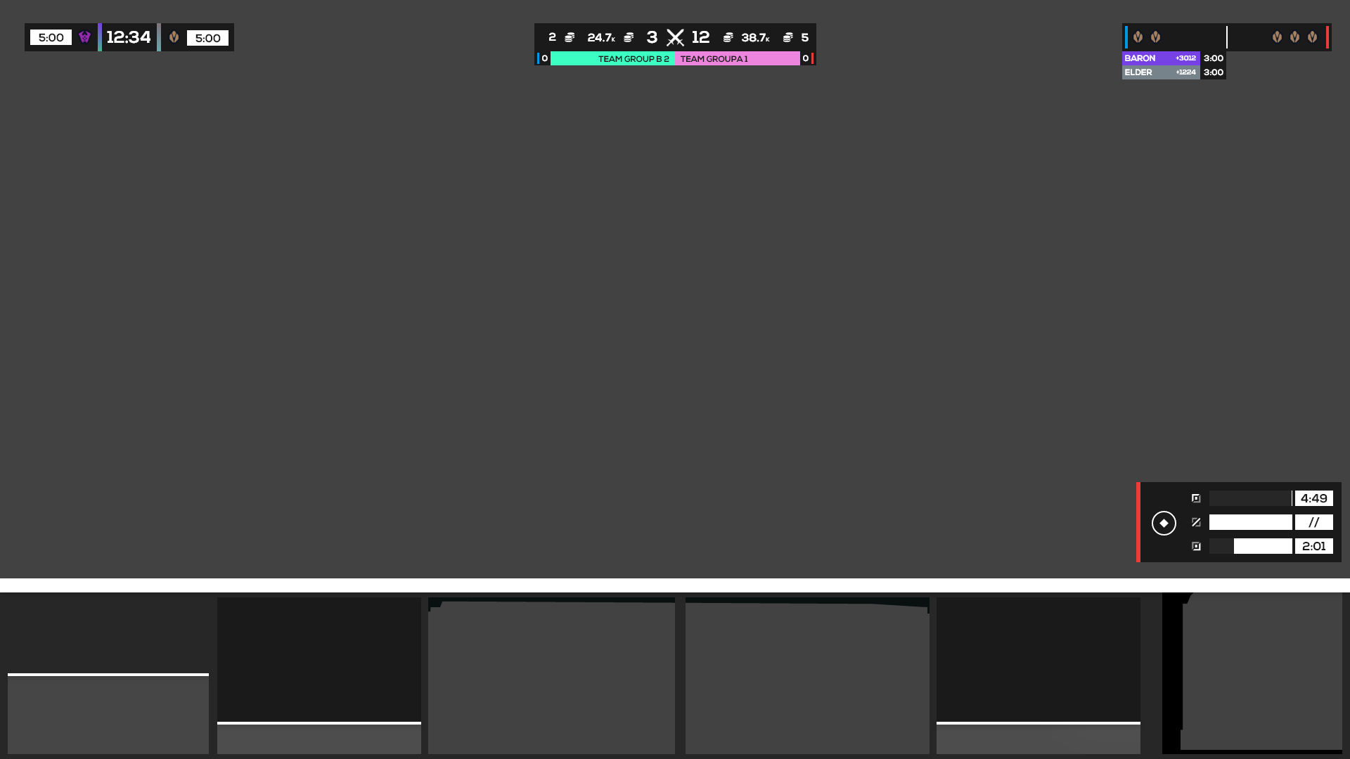
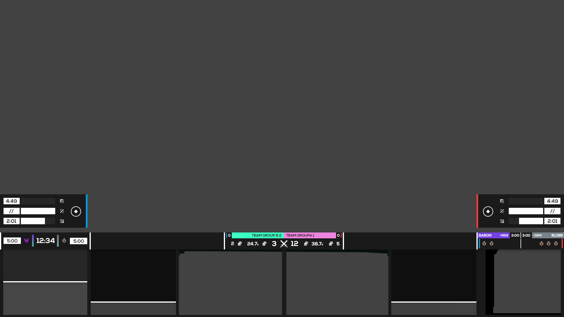
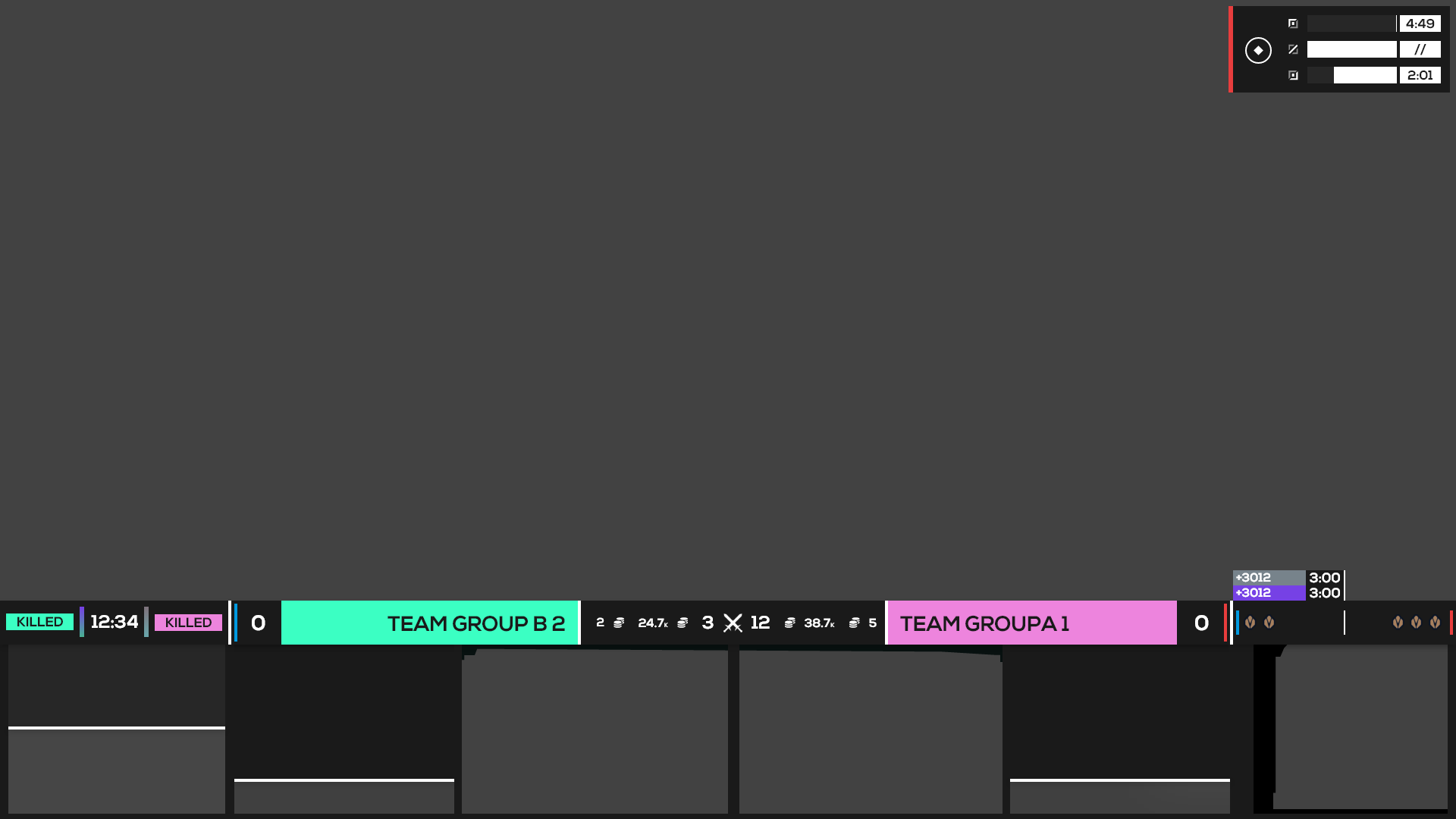
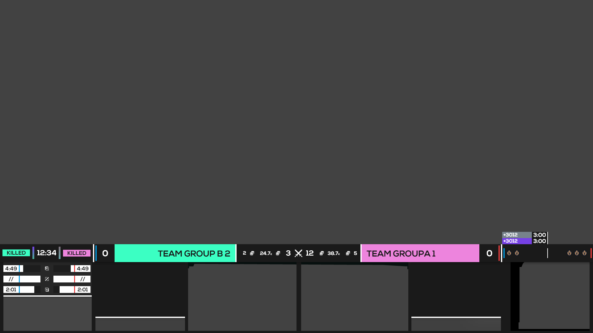
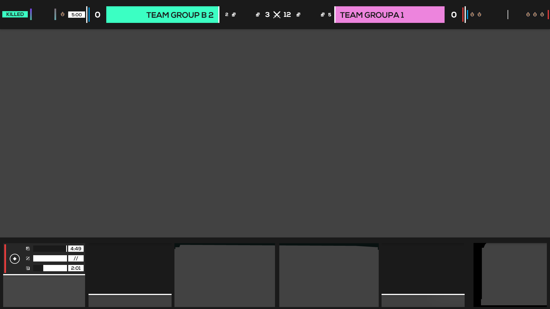
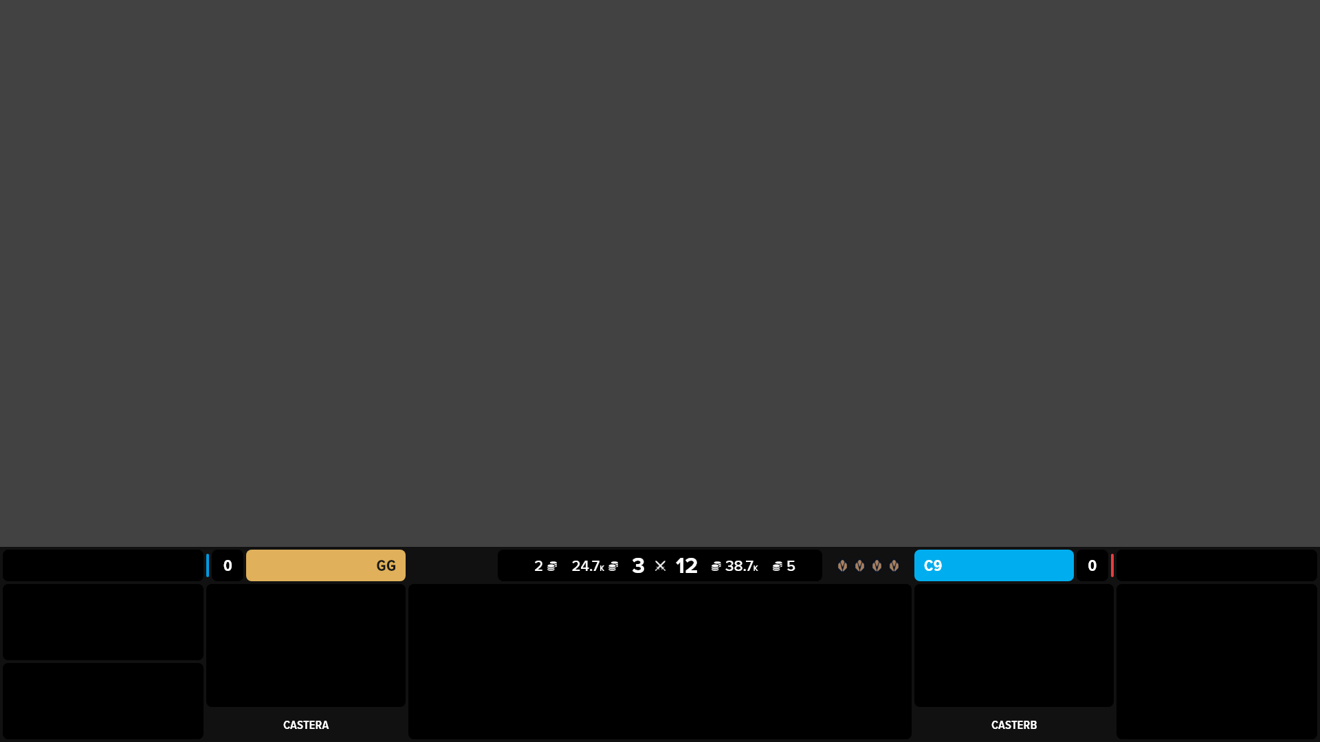
After experimentation, I decided to pursue a singular HUD inside of one that’s split across the screen. This way the viewer only has to move their eyes along a singular linear plane in order to receive all the information they need outside of the actual gameplay. The hierarchy of the HUD, set from the middle to the outer edges, communicates information most relevant to each team and the state of the game and most relevant to the overall game out to the current moment and later game events. Additionally, the HUD can be collapsed to take up just 5% of the total height of the screen or cropped perfectly for vertical form content like TikTok, while still showing the most important and relevant information.
CH-03
UX Building