Brand Identity Design
HOMEPLATE
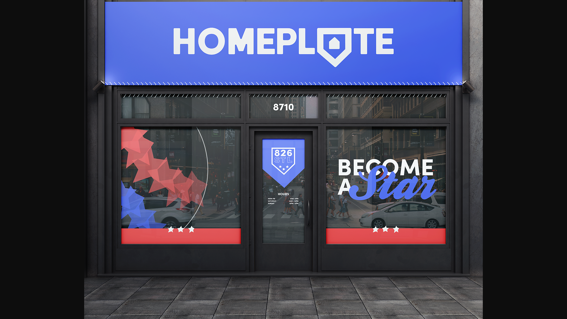
826 National is a nonprofit dedicated to tutoring students and encouraging them to learn. Their various locations utilize creative and 'out-of-the-box' storefronts to intrigue students and establish friendly and safe environments for them to feel inspired to learn in.
For this project I worked to develop an idea for a new location in St. Louis, MO along my research partner Zoe Talley, before moving on to work alone on designing a successful and consistent brand identity for 826 National - St. Louis.
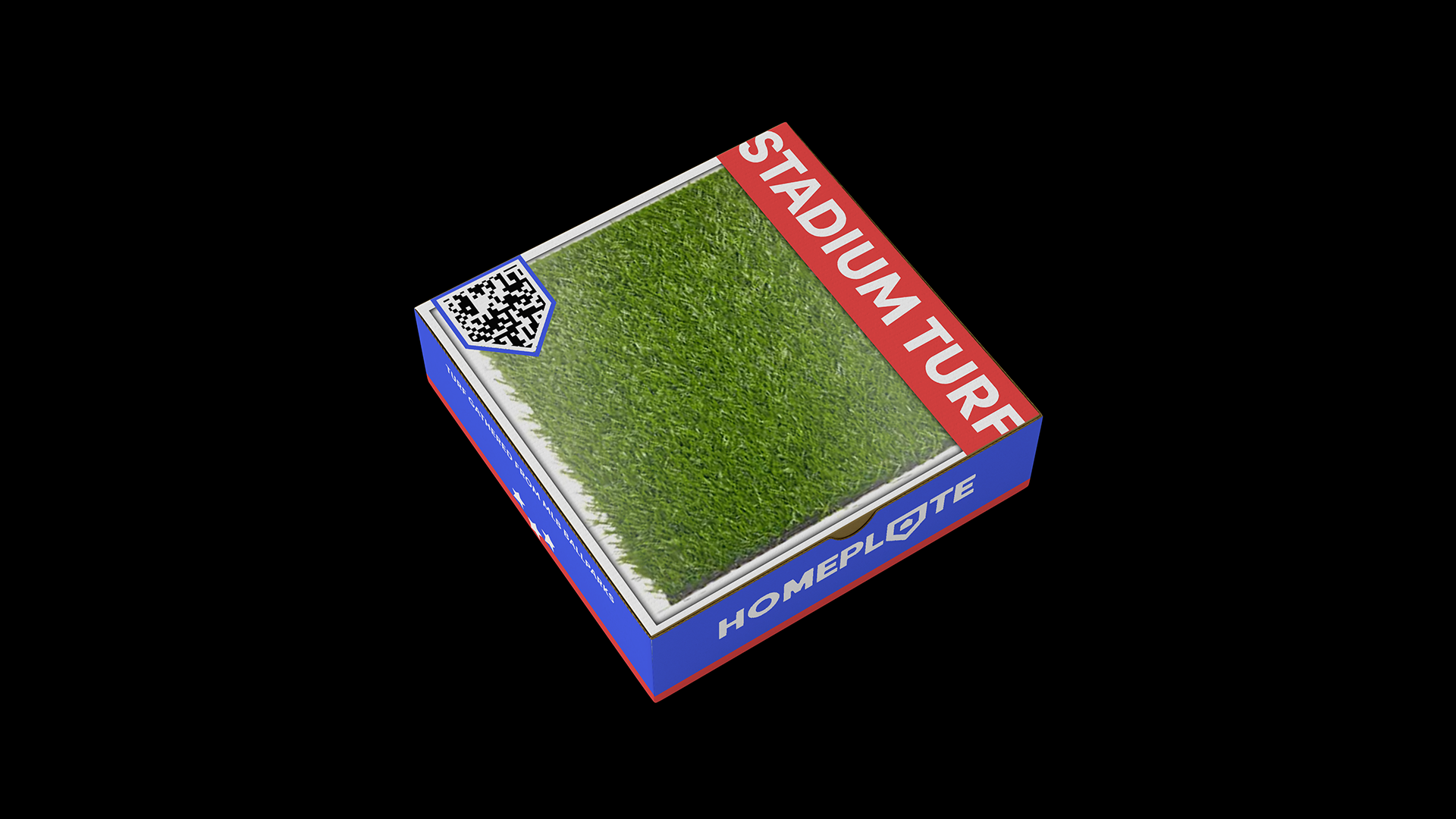
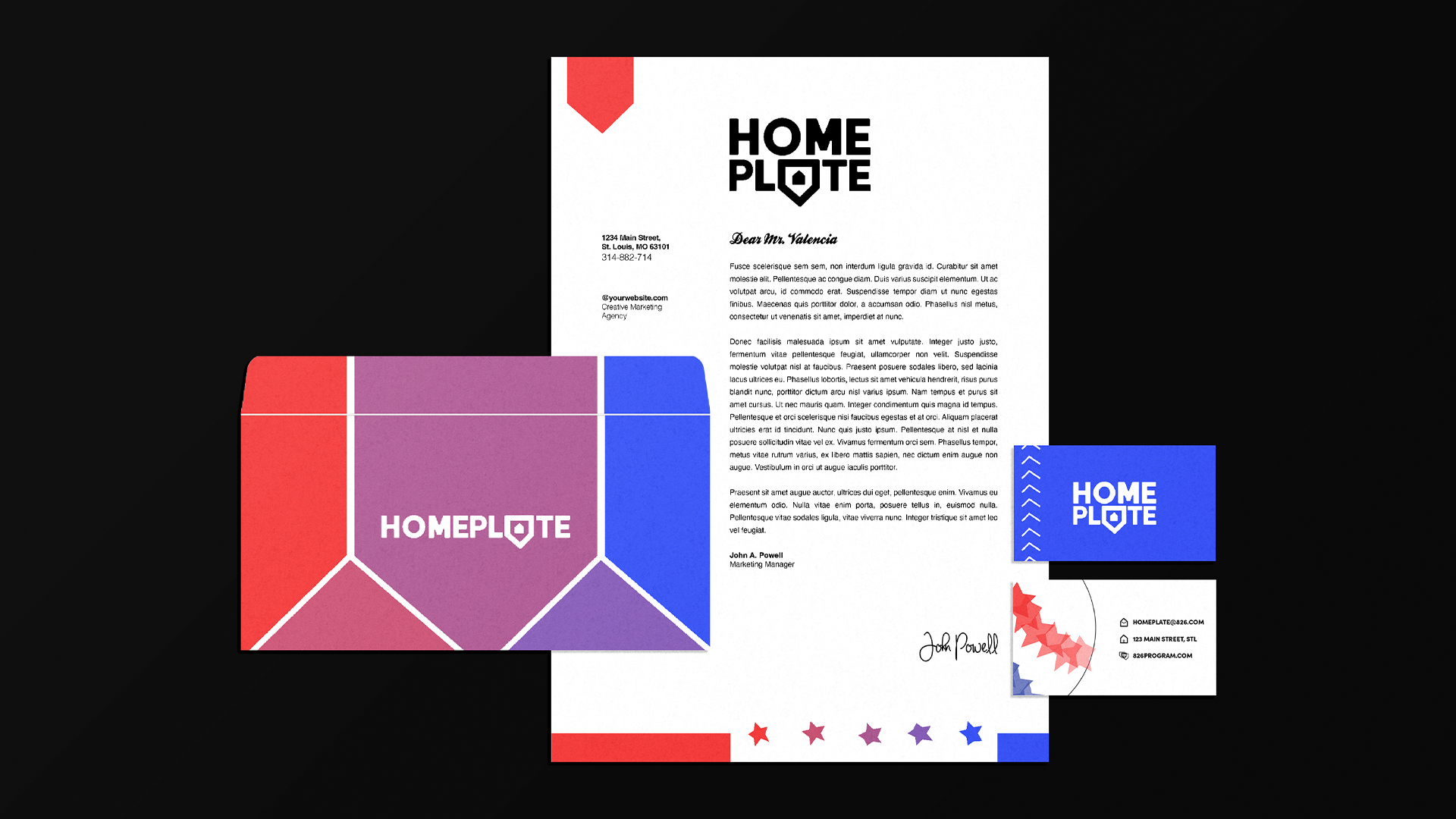
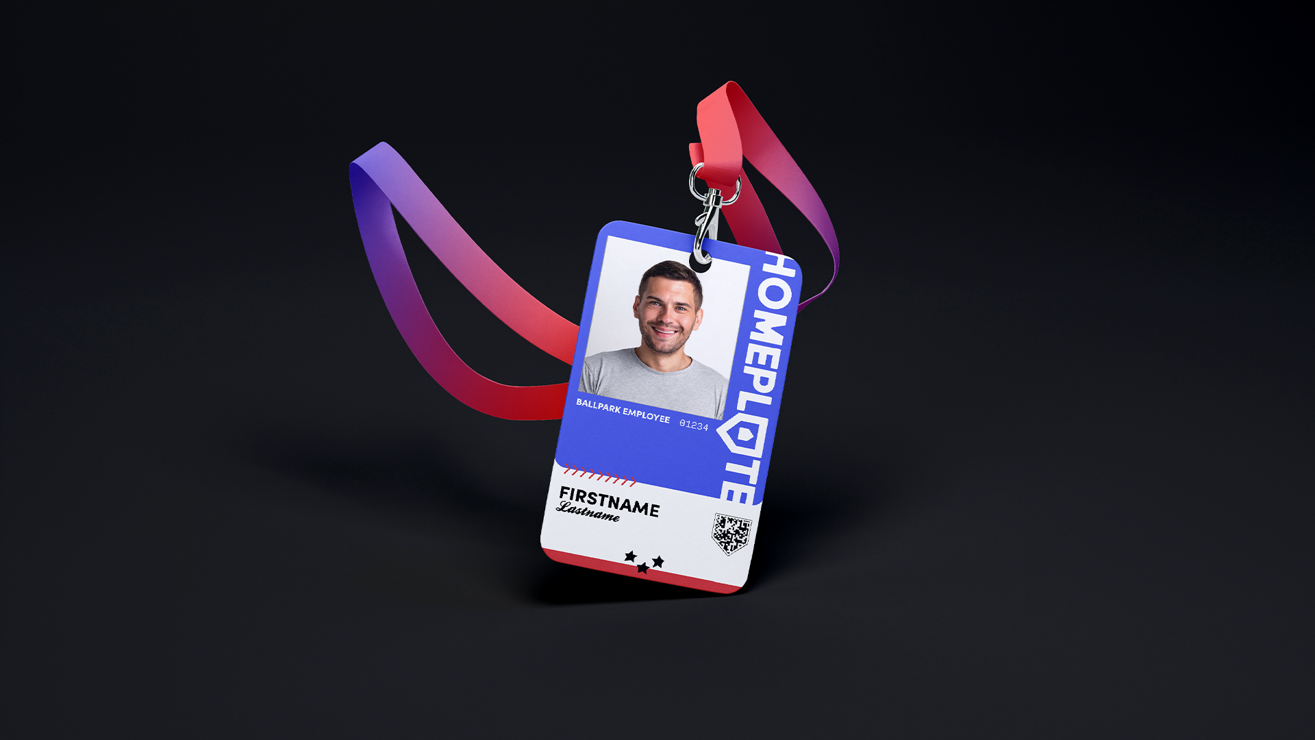
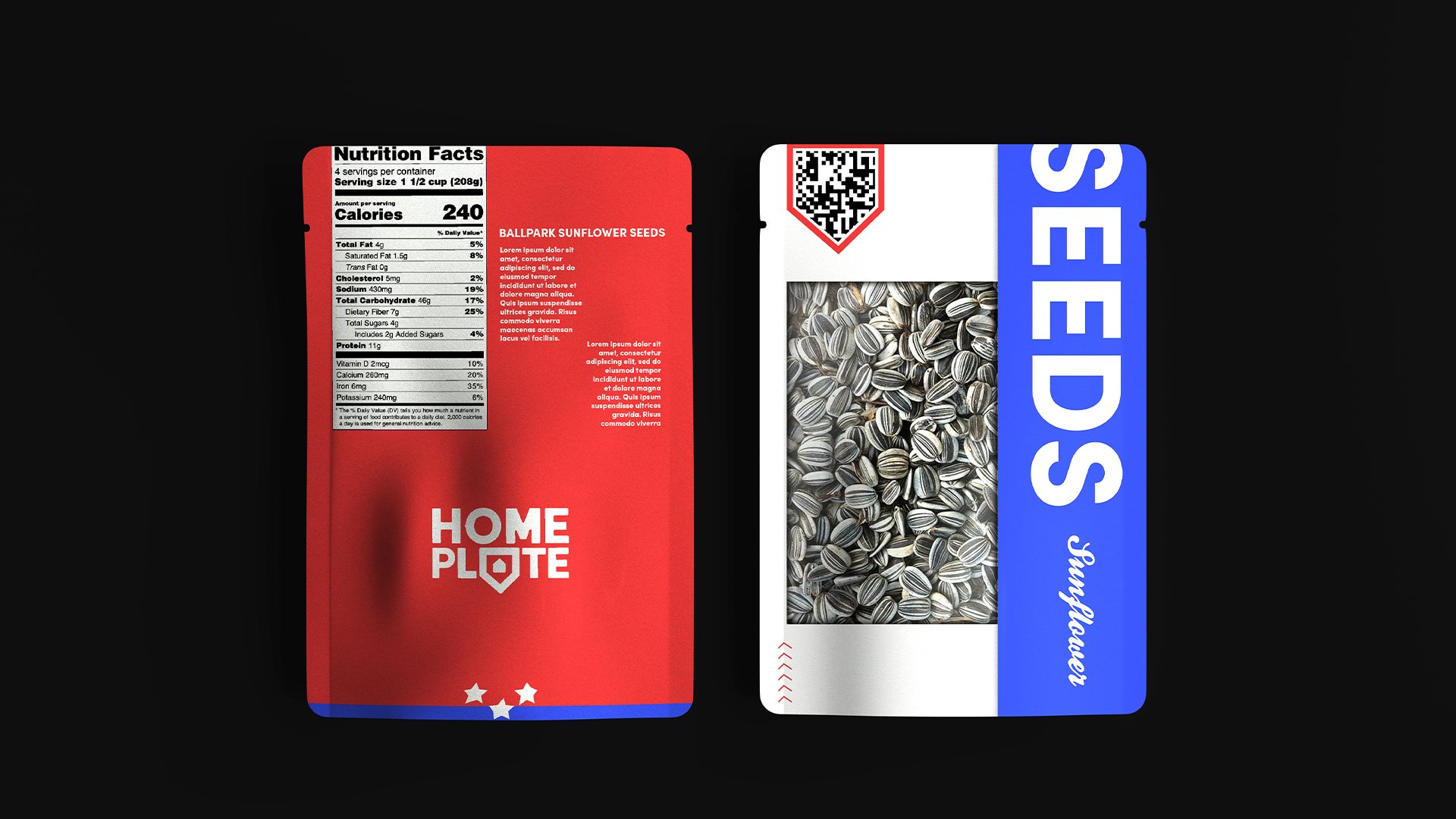
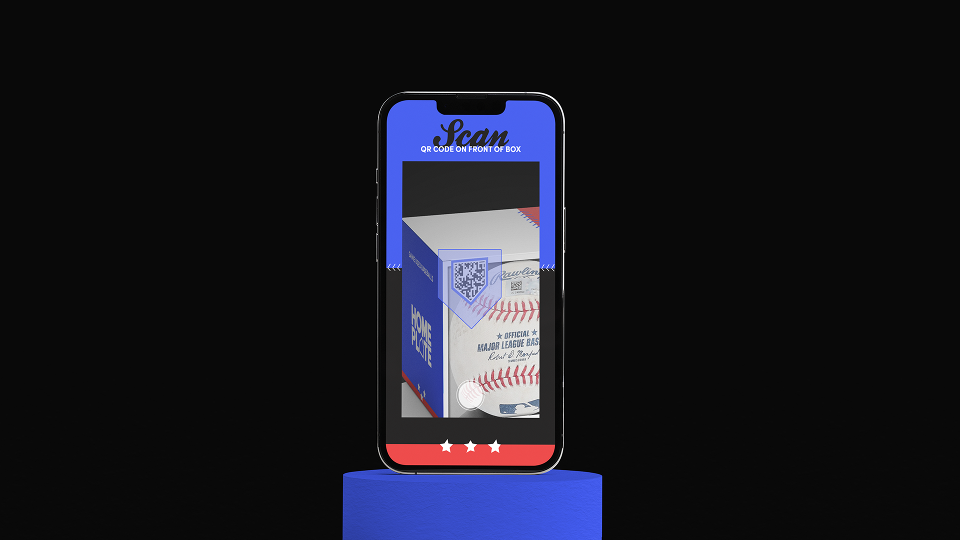
Before diving into creating a unique and distinctly St. Louis storefront and brand, I teamed up
Zoe Talley to research and discover the heart and soul of the St. Louis city and community. Through our research we found many different hobbies, landmarks, and traditions that make St. Louis-- St. Louis. For my own interpretation of the new location, I focused in on the cities longtime love and history with the sport of Baseball.
CH-01
Researching
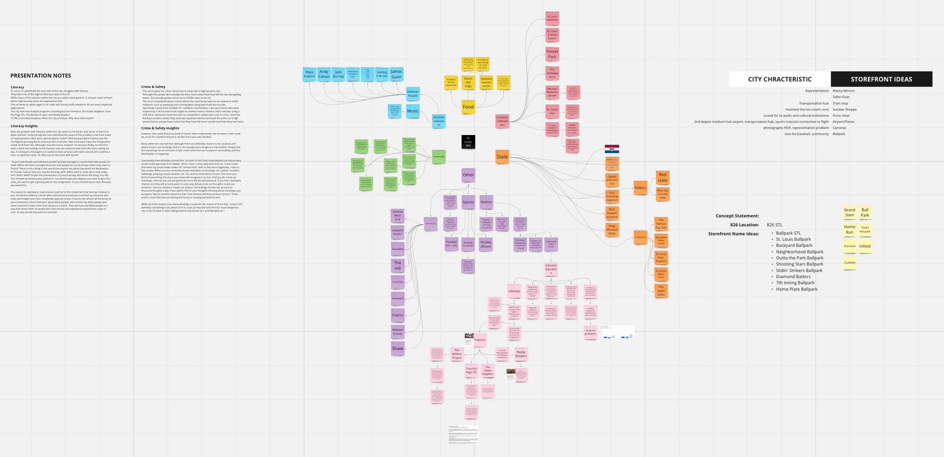
Mission Statement
826 STL engages children in a playful and approachable ballpark inspired environment and disengages them from real-world stress by creating a place to escape
Brand Essence
Playful, engaging, and approachable
Brand Promise
To create a retail space that invites kids to learn by establishing a consistent brand strategy that's friendly and recognizable
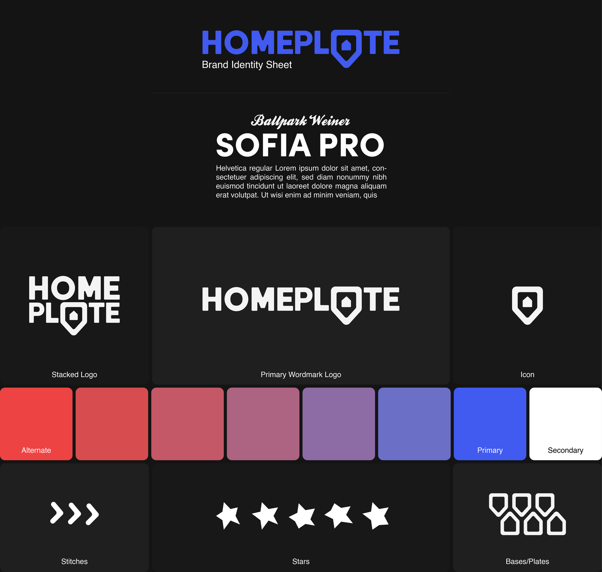
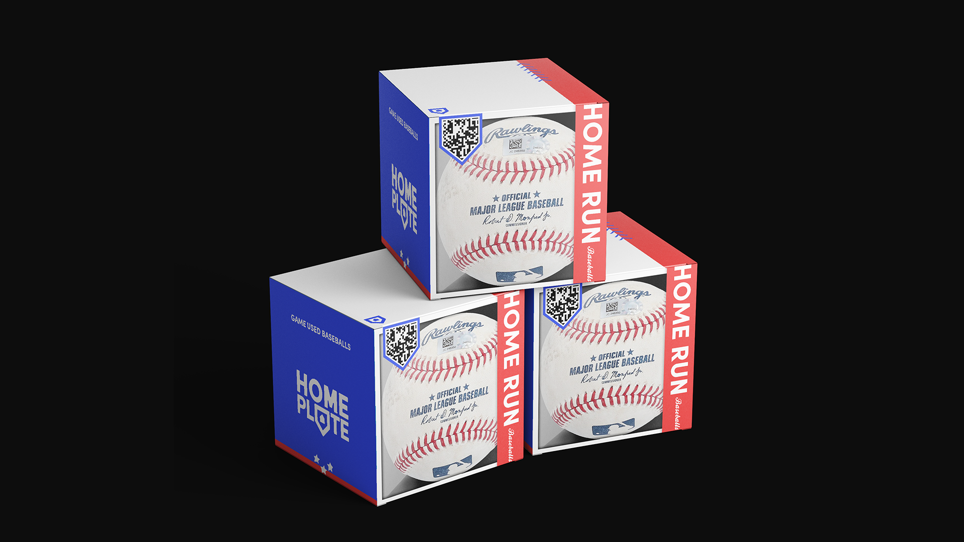
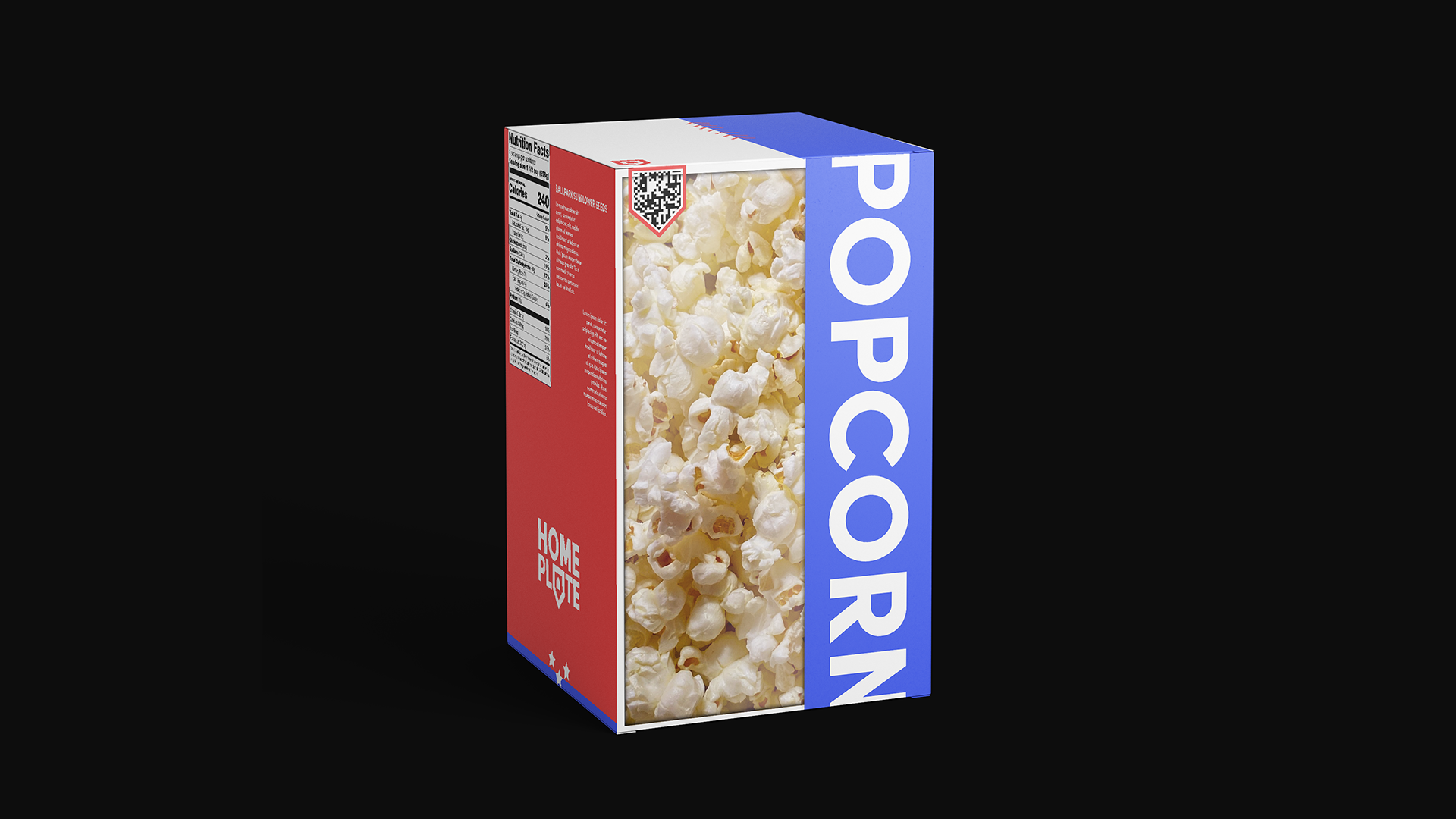
After choosing a name and solidifying a theme for the brand and storefront I moved on to developing a recognizable and friendly brand identity. The name 'HOMEPLATE' is inspired by the double-meaning of the term. In the baseball world it's one of the most recognizable and important terms, the place where all the action starts and ends. On the other side, its a term that can refer to your home and community. Using that I played with the symbolism of a home-plate, baseballs and their stitching, street signs, and stars to create a welcoming and familiar identity.
CH-02
Sketching
Continuing on into solidifying the brand, I worked to find a type system that felt playful, yet sophisticated in a way that might be associated with professional leagues. For the icon system I designed a set of stars that are all slightly different from each other, taken from the idea that everyone is unique and "no two snowflakes are the same". before applying it into real-world situations.
CH-03
Branding